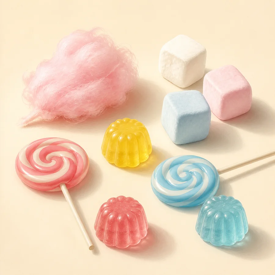
Pattern can make a small sweet visually powerful. A spiral concentrates movement, stripes establish direction, and dots create rhythm. The editorial challenge is to combine them without turning every surface into a competing focal point.
Let a spiral carry movement
A spiral leads the eye inward or outward even in a static image. On a lollipop or piped rosette, the curve is already a strong gesture; give it a relatively calm background and avoid placing another high-contrast spiral immediately beside it.
Scale changes the effect. One large pale spiral can anchor the frame, while a smaller stronger spiral can echo it at a distance. This creates relation without exact repetition.
Use stripes to create direction
Diagonal stripes feel more active than horizontal bands because they imply movement across the form. Vertical piping can emphasize height, while a narrow horizontal ribbon can visually stabilize a tall cupcake.
Keep stripe width related to the object. Very fine bands on a small decoration can disappear in photography or create visual vibration. A wider interval is easier to read and easier to keep distinct from neighboring sprinkles.
Treat dots as spacing, not filler
Dots work through interval. A few large dots create a playful hierarchy; many tiny dots become texture. Sprinkles, sugar pearls and piped points may all appear dot-like from a distance, but their material behavior and ingredients are not interchangeable.
Before adding dots, look at the empty spaces they occupy. If the base decoration is already detailed, leave one clear zone rather than filling it automatically. Restraint helps the viewer distinguish the designed motif from incidental crumbs or reflections.
Separate appearance from formulation
The ACS describes different sugar structures and confectionery textures, while the FDA requires product-specific ingredient and allergen information to come from the actual label. A glossy stripe or crystal-like dot cannot establish what it is made from.
In a real styling project, keep food decoration and non-food props separately inventoried and clearly identified. This illustration contains imagined digital forms only; it is not evidence of edibility, ingredients or preparation.
Working takeaway
Use spirals for movement, stripes for direction and dots for rhythm—then confirm the real material separately from its appearance.
Sources and scope
These references support the stated factual frame. They do not endorse Candy & Color or its illustrations.
- U.S. Food and Drug AdministrationFood Allergies
Ingredient and major-allergen labelling context for packaged foods in the United States.
- U.S. Food and Drug AdministrationTypes of Food Ingredients
How ingredient lists and certain color or flavor terms appear on labels.
- American Chemical SocietyCandy Chemistry
Educational overview of glassy, amorphous and partially crystalline confectionery structures.
- American Chemical SocietyHalloween Candy Chemistry
Educational comparison of common hydrocolloids, appearances and textures in gummies and related sweets.